Turning podcast listeners into CEU* earners.
* Continuing Education Units (CEUs) are credits that measure participation in professional development programs.
* Continuing Education Units (CEUs) are credits that measure participation in professional development programs.
Product Designer (0→1) + Implementation
UX strategy, IA, interaction design, UI + design system, iPad app, WordPress implementation, QA, handoff documentation
WordPress + LearnDash (LMS) + WooCommerce (commerce) + custom components/styles
BCBAs, RBTs, clinic admins (internal training as an add-on)
~4 months
Cooperant Learning is an evidence-based continuing education platform where behavior professionals can discover CEU content, purchase quickly, complete quizzes, and download certificates—with progress tracked in a purpose-built learning dashboard.
Sparks Behavioral Services had high-quality educational content (podcasts + trainings), but the experience needed to do three things exceptionally well:
Build trust fast
(CEUs require credibility, policies, and clarity)
Reduce friction in
the “pay → quiz → certificate” journey
Support multiple audiences
(BCBAs, RBTs, admins) without turning the platform into a maze
This wasn’t a redesign—it was a new product: define the core journeys, build the system, and ship something stable enough for real users and real transactions.
Try hovering to fight constraints
Approach (what I actually did)
Benchmark + define the journeys
(discovery → purchase → learning → certificate)
Low-fidelity wireframes
to lock IA, states, and page responsibilities
Design system
to ensure consistency across marketing, listings, and LMS/commerce templates
Implementation + QA
(state handling, logged out vs logged in experiences, purchase flows, certificate loop)
Handoff
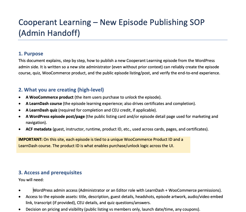
(documented how to upload episodes/courses, set product IDs, and avoid breaking templates/styles)
Key Decisions
Use one canonical course URL with state-based UI
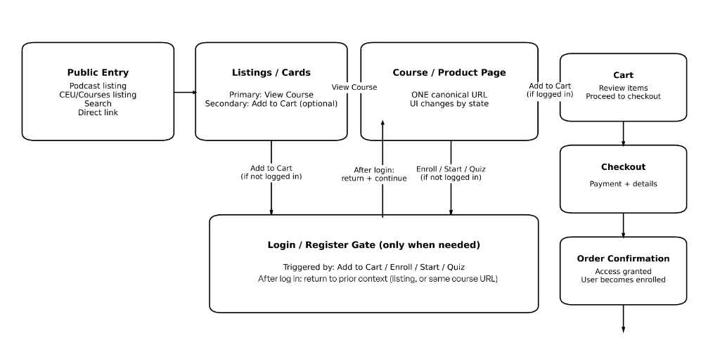
Instead of splitting “logged out,” “purchase,” and “completed” into separate pages, I designed a single course page that changes its UI based on user state.
Rationale
- •Sharing is simpler (one link works for everyone)
- •UI stays consistent while CTAs change meaningfully
- •Fewer templates reduces breakage risk as content scales
Tradeoff
State logic must be explicit and tested. I handled this by defining clear states and ensuring every CTA returns users to the same course URL after gating.
Gate login/register only at the moment of intent
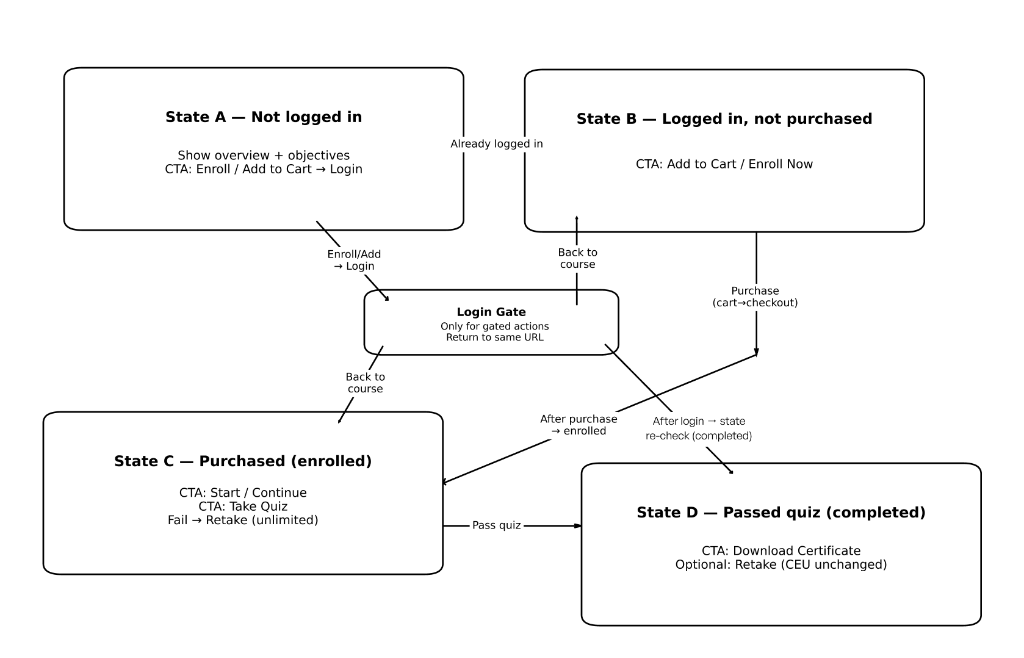
Users can browse freely. Login/register triggers only when a user tries to Add to cart / Enroll / Start / Take quiz.
Rationale
Forcing account creation too early kills momentum. Gating only on intent preserves discovery while still protecting paid learning actions.
Tradeoff
This requires careful “return-to-context” handling after login. The experience was designed so users land back where they started (course page or listing), not dumped somewhere generic.
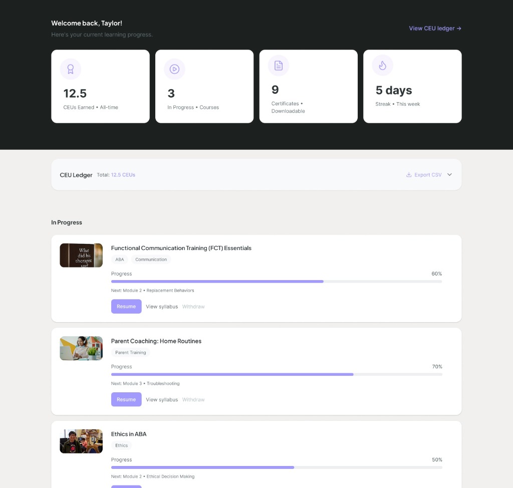
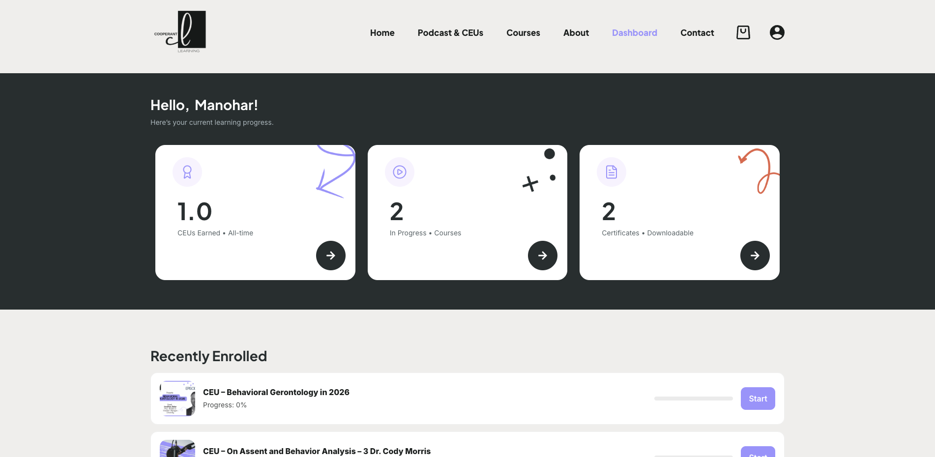
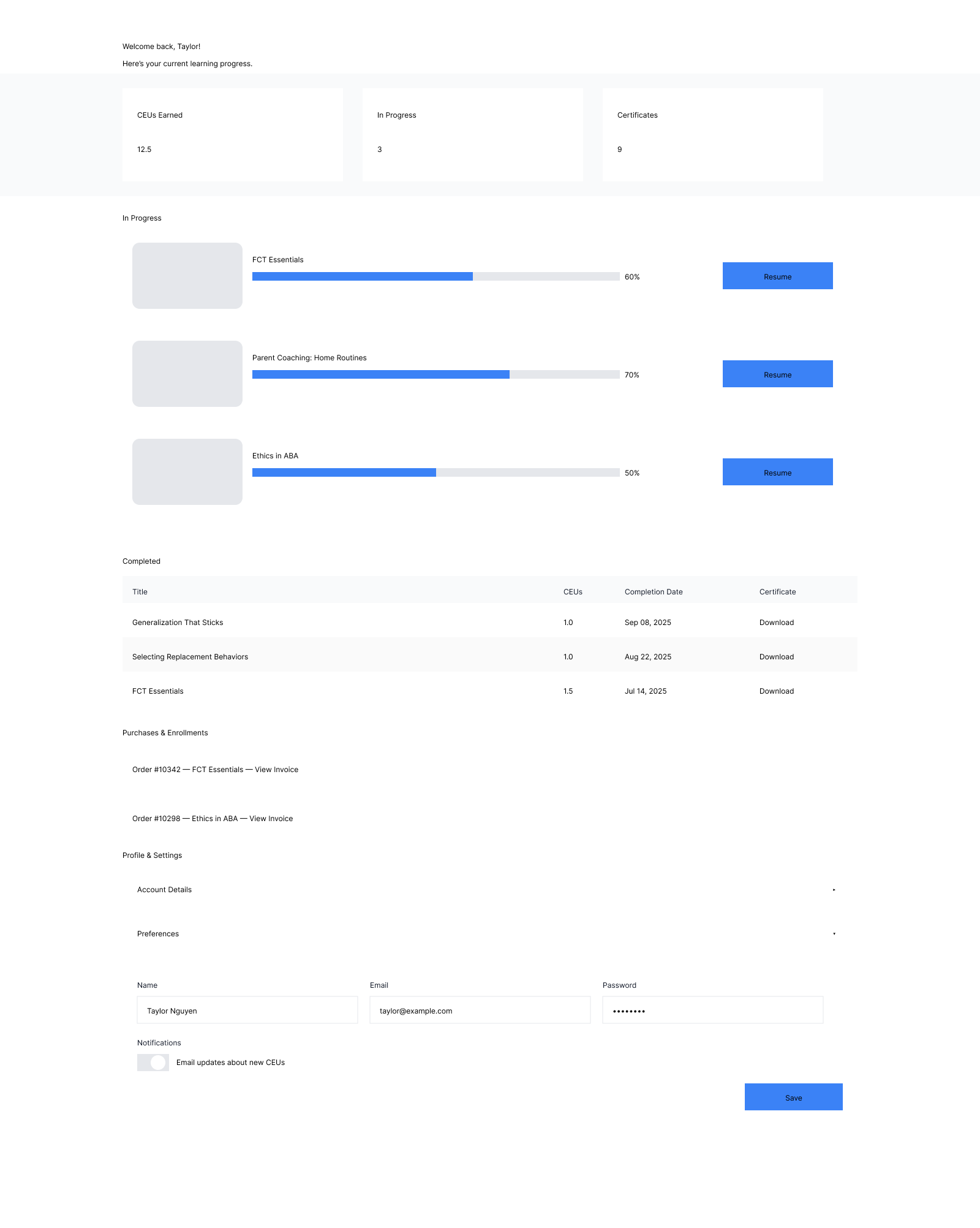
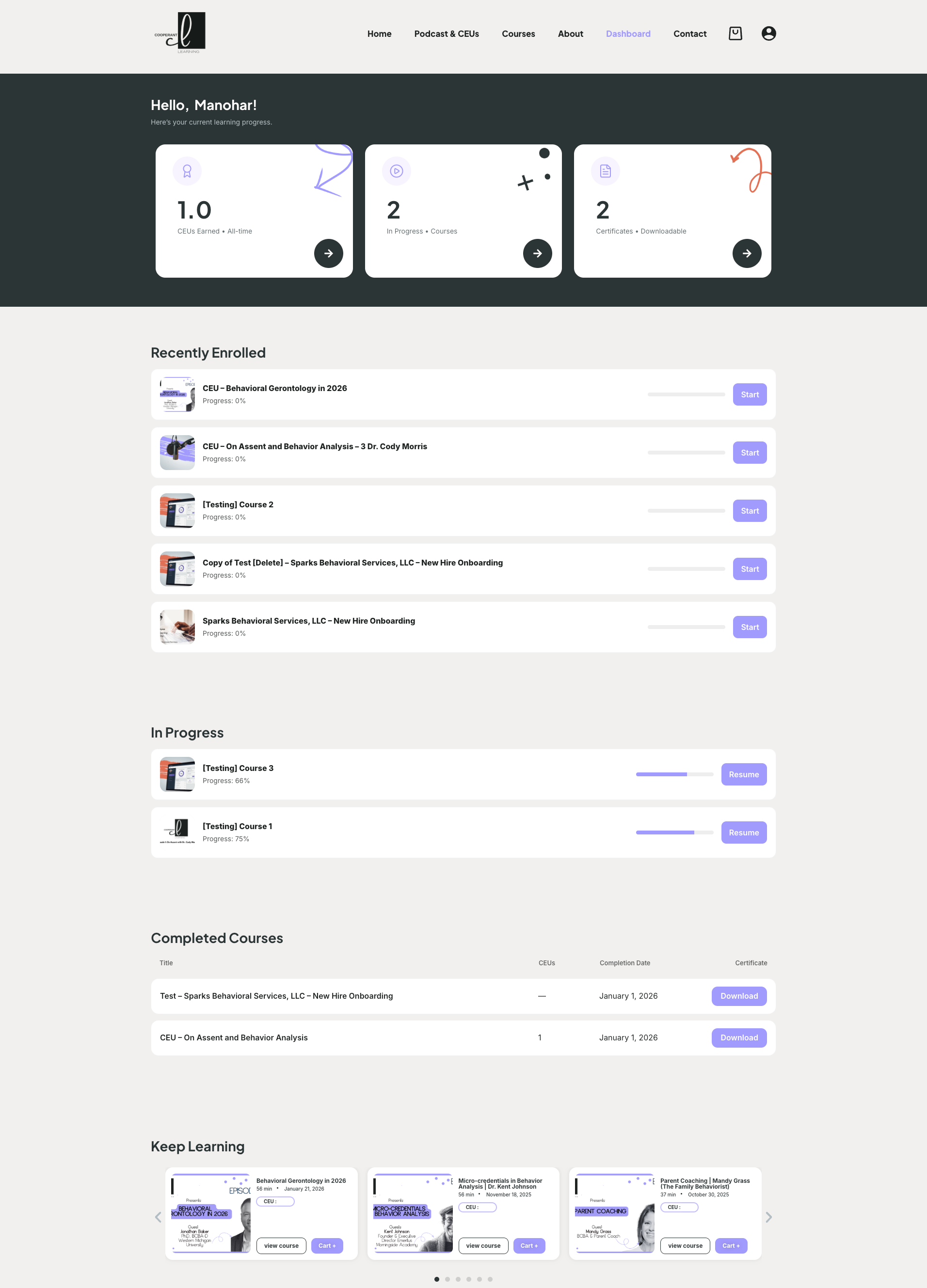
Separate “Learning Dashboard” from “My Account”
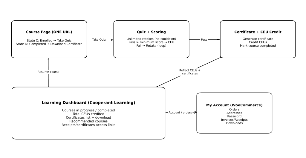
Learning Dashboard = progress, courses in progress/completed, CEUs earned, certificates My Account = orders, downloads, addresses, payment methods, profile/password
Rationale
LearnDash and WooCommerce both offer “account-like” areas; combining them often creates confusion. Separation keeps each space clean and predictable.
Tradeoff
Users need a simple bridge between these spaces. I added clear cross-links (“My Account” and “Edit Profile”) and consistent navigation patterns.
What shipped (v1 scope)
- -Home page positioned around the core promise: Listen. Learn. Earn CEUs.
- -About + Contact pages with FAQs and support clarity
- -Clear ACE/provider trust cues and policy access (privacy/terms/CEU policy)
Proxies (what I can credibly claim now)
Because the product is newly launched, I’m framing impact using defensible proxies rather than fabricated analytics.
This is what I designed the product to measure (and how I’d validate success)
Challenges & how I handled them (the "messy middle")
Multiple platforms, one user experience
LearnDash and WooCommerce each create their own “shape” of UI and account behavior. I unified the experience by:
- -Defining clear surface ownership (learning vs commerce)
- -Standardizing components via the design system
- -Testing each state so CTAs never contradict the user’s reality (logged out vs enrolled vs completed)
Keeping the experience scannable
This platform serves busy professionals. I used:
- -Strong CTA hierarchy
- -Short, repeatable patterns (cards, tabs, chips)
- -“One obvious next step” per state
Collaboration & handoff
I worked directly with stakeholders to ensure the platform could be operated without me
- -Defined a repeatable episode/course publishing process
- -Documented how product IDs map to episodes and how templates should be used
- -Provided a handoff brief to prevent accidental layout breakage (theme/template/CSS guardrails)
What I’d do next (iteration roadmap)
Instrument analytics + event tracking (funnel + completion + support reasons)
Run 5–8 usability sessions focused on purchase and certificate retrieval
Mobile stress-test key pages (episode, course states, checkout, dashboard tables)
Content ops hardening (templates, validation checks, admin UX)
Conversion experiments (CTA wording, episode → CEU framing, trust modules placement)
Reflection (why this project matters)
Cooperant Learning is the kind of product design work I want to do
Full-stack UX (strategy → system → UI → real implementation) on a platform where trust, clarity, and flow directly impact whether users can earn credit and prove it professionally.